
Time for a bit of fun with CSS!
The following examples are all created using live text and the CSS text-shadow property. Apart from the Letterpress effect, all of the following examples make use of multiple shadows, and as such will only work on the following browsers.
- Firefox 3.1+ (Mac/Win/Lin)
- Safari 4+ (Mac/Win)
- Chrome (Mac/Win)
- Opera 9.5+ (Mac/Win/Lin)
Unfortunately Internet Explorer (6/7/8) has no support for the text-shadow property.
If you’re not familiar with the text-shadow property here’s a example and explanation:
h1 {
	text-shadow: -2px 2px 3px #ff2d95;
}
It breaks down like this: create a shadow below the h1 and offset it -2px horizontally, 2px vertically, blur it by 3px, and colour it pink.
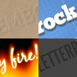
1 Classic Letterpress Effect

#letterpress h1 {
	text-shadow: 0px 1px 1px #4d4d4d;
	color: #222;
	font: 80px 'LeagueGothicRegular';
}
This is a very simple effect to achieve. To create the appearance of text that has been stamped, choose a text colour that is darker than the background, and then create a 1px text shadow with a 1px blur and offset it down 1px. Make the text-shadow slightly lighter than the background.
2 Cloudy Text Effect

#cloud9 h1 {
	text-shadow: 0px 0px 10px rgba(255,255,255,0.6), 0px 0px 30px rgba(255,255,255,0.4), 0px 0px 50px rgba(255,255,255,0.3), 0px 0px 180px rgba(255,255,255,0.3);
	color: rgba(255,255,255,0);
	font: 80px 'ChunkFiveRegular';
}
This effect relies on multiple text shadows and rgba colours. If you don’t already know, rgba colours work like this
rgba(255,255,255,0.5)
Basically, that’s white in rgb, (255,255,255) at 50% transparency (0.5).
To make the Cloudy effect, first I gave the text an rgba value of rgba(255,255,255,0) = completely transparent, and then built the ‘Cloud’ up from layers of varying transparency and blur.
3 Embossed Text Effect

#embossed h1 {
	text-shadow: -1px -1px 1px #fff, 1px 1px 1px #000;
	color: #9c8468;
	opacity: 0.3;
	font: 80px 'Museo700';
}
To Create the Embossed look, I used 2 diagonally offset shadows. One white shadow offset to the top left, and one black shadow offset to the bottom right. Then the text was given a colour similar to the background image and the whole thing was given an opacity of 0.3 so that the background image could be seen through the text.
4 City Lights Text

#citylights h1 {
	color: #fff;
	text-shadow: 0 0 5px #fff, 0 0 10px #fff, 0 0 15px #fff, 0 0 20px #ff2d95, 0 0 30px #ff2d95, 0 0 40px #ff2d95, 0 0 50px #ff2d95, 0 0 75px #ff2d95;
	letter-spacing: 5px;
	font: 80px 'MisoRegular';
}
This is built up from 8 shadows with no offset and increasing amounts of blur. The first three shadows are white like the text, the remaining five shadows are all pink.
5 Burning Text Effect

#burning h1 {
	color: #fff;
	text-shadow: 0px -1px 4px white, 0px -2px 10px yellow, 0px -10px 20px #ff8000, 0px -18px 40px red;
	font: 80px 'BlackJackRegular';
}
Three shadows — white, yellow, red — with increasing vertical offset and blur.
6 Retro Text Effect

#retro h1 {
	color: #d7ceb2;
	text-shadow: 3px 3px 0px #2c2e38, 5px 5px 0px #5c5f72;
	font: 80px 'BazarMedium';
	letter-spacing: 10px;
}
Two diagonally offset shadows without blur. The first shadow is exactly the same colour as the background, the second is a lighter shade of the background colour.
7 3D Text Effect

#three-d h1 {
	color: #fff;
	text-shadow: 0px 1px 0px #999, 0px 2px 0px #888, 0px 3px 0px #777, 0px 4px 0px #666, 0px 5px 0px #555, 0px 6px 0px #444, 0px 7px 0px #333, 0px 8px 7px #001135;
	font: 80px 'ChunkFiveRegular';
}
Bold white text, with seven descending shadows, each has no blur and is an increasingly darker shade of grey. The eighth shadow is dark-blue and blurred to enhance the overall effect.
Conclusion
The Live Demo makes use of @font-face embedding and I have used the following fonts:
- League Gothic Regular: Letterpress Effect
- Chunk Five Regular: Cloudy Effect & 3D Effect
- Museo 700: Embossed Effect
- Miso Regular: City Lights Effect
- Black Jack Regular: Burning Effect
- Bazar Regular: Retro Effect
In each of these cases the choice of font and background can greatly influence the result. For example, in the last example the slight perspective of the blue background adds to the 3D effect.
You can see a live demo of the effects here: CSS based text effects demo →