
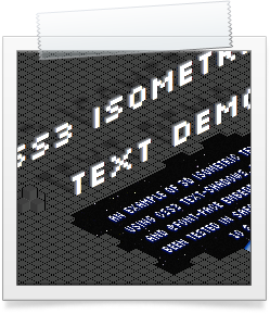
Just recently I have been playing around with the multiple text-shadow capabilities of CSS3. Now, building on top of that I have produced a method for creating 3D isometric text, by using multiple text-shadows and 2D transforms.
In this demo the 3D text is created from multiple offset shadows that increase in darkness with no blur applied. The text is then made isometric by applying a 2D transform to skew the text in the Y axis to an angle of -26.6°. (OK, true isometric art is set at -30°, however pixel-based isometric art is set at -26.6° as this produces the smoothest lines).
-webkit-transform: skewY(-26.6deg);
-moz-transform: skewY(-26.6deg);
-o-transform: skewY(-26.6deg);
The shadow under the text is produced by a second line of text that is skewed twice — once in the Y axis to -26.6°, and then again in the X axis to 63°. To get it looking blurred, the colour of this text is set to transparent: rgba(0,0,0,0) and its text-shadow is set to transparent black with a 4px blur: text-shadow: 0 0 4px rgba(0,0,0,0.3);.
color: rgba(0,0,0,0);
-webkit-transform: skew(63deg,-26.6deg);
-moz-transform: skew(63deg,-26.6deg);
-o-transform: skew(63deg,-26.6deg);
text-shadow: 0 0 4px rgba(0,0,0,0.3);
This shadow text is created using Javascript, so that the titles don’t appear twice to search engines.
This demo works only for Firefox, Safari, Chrome & Opera. You can see it here: CSS3 Isometric Text Demo